OneNote UWP Outline Options
It’s occasionally very frustrating when new versions of tools don’t offer the same capabilities as their predecessors. Today, I give you the ordered-list options in OneNote 2016 vs OneNote UWP:
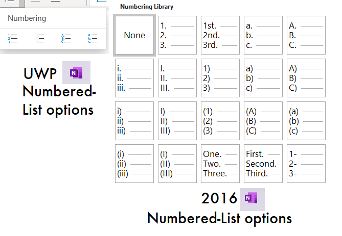
That’s just embarrassing. The whole point of the product is to take notes, and options for different outline headings would seem to be a basic feature.
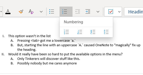
However, it’s not as bad as it looks. It occured to me that the new version can still successfully edit old outlines, so the capability to understand all the heading options must be there. Upon investigation, it turns out that you can just type the heading you want, and the UWP version will turn it into that type of list.
I guess that’s better than nothing, but features should be discoverable! I’m glad Microsoft has decided to keep working on OneNote 2016 after all. They need to drop the toy platform and focus on what worked. The PC didn’t change when mobile hit–right or wrong– so it doesn’t need a dumbed-down mobile interface. Most power users still spend a lot of time in a TTY emulator, and they like it that way. Let’s just refine what was there. At the end of the day, you can’t design a revolution. If the PC radically changes, it’s going to happen by chance and unexpectedly (think: the WWW), not in a boardroom where people sit around thinking “how can we make Windows more like my iPhone?”